Kommuna.
Search for housing. Find friends, too.
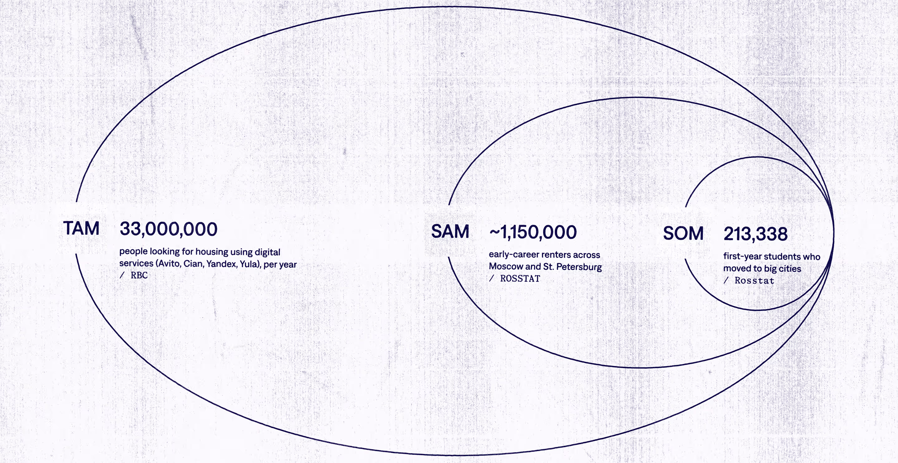
Problem: A housing crisis caused by demand exceeding supply(1) hits harder the students moving to big cities alone. For most, the choice is bleak: poor housing or incompatible roommates.
Being students ourselves, and talking to our peers, we noticed a few problems when looking for housing:
- Most students can’t afford to live alone in the city.
- Sharing an apartment usually means living with strangers — and mismatched habits often lead to tension and discomfort.
- On top of this, searching for an apartment and handling maintenance takes time and energy — adding stress to the already heavy load of studying in a new city.
(1): According to Izvestia, rental listings in Russia’s big cities fell by up to 31%, while prices rose by up to 16% compared to the previous year.
I'm so sick of going to see these apartments and negotiating with these strange landladies.
If you want to find decent housing, you either need to have good friends or spend a month on Cyan.
If my personal hell existed, it would be apartments with Soviet renovations on Avito.
Research: How do people look for housing — and how they choose flatmates?
Wanting to prove our notions against reality, first we conducted a cheap market research to see if there really is a need for such product. And we found a growing trend on solving housing by co-living (2)(3)(4).
(2): Grand View Research (2024) — Co-living Market Size, Share & Trends Analysis Report (link).
(3): Uyttebrouck, Constance & van Bueren, Ellen & Teller, Jacques (2020) — Shared housing for students and young professionals: evolution of a market in need of regulation. Journal of Housing and the Built Environment (link).
(4): Kvietkute, Dana & Hauge, Åshild (2021) — Living with strangers: exploring motivations and stated preferences for considering co-housing and shared living in Bergen, Norway. Housing and Society (link).
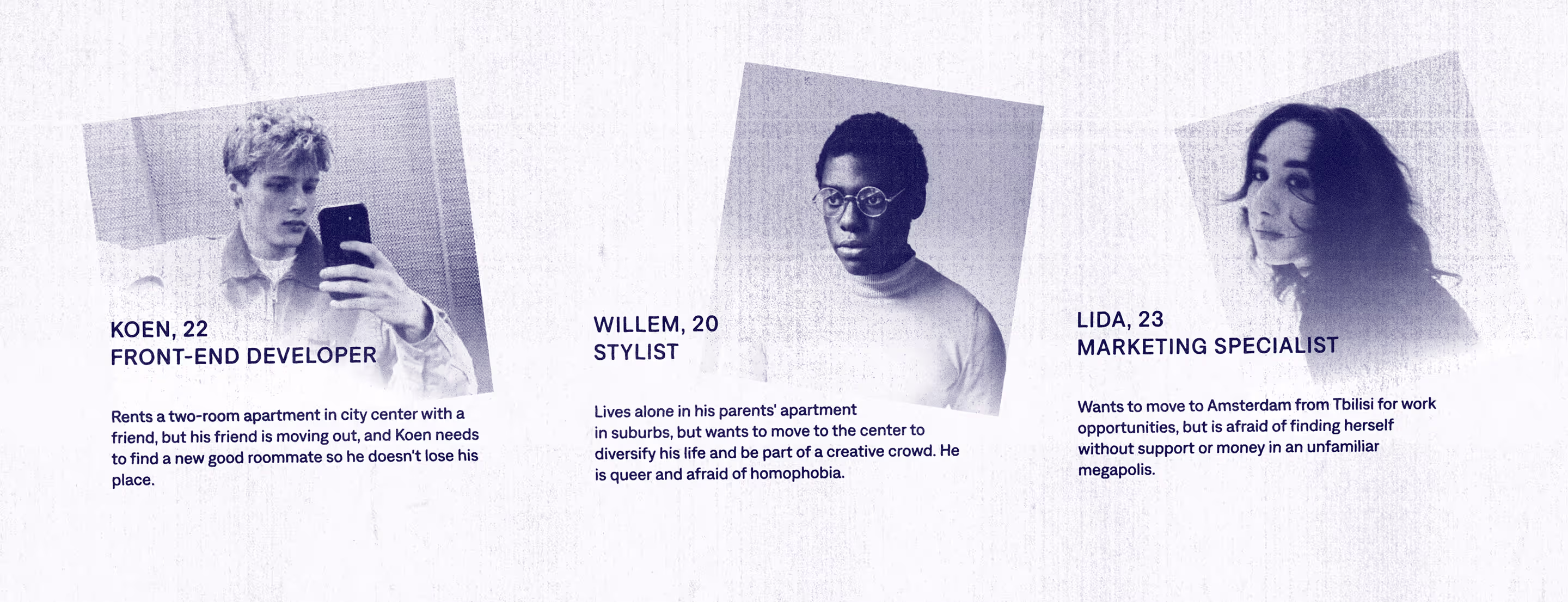
This research also helped distinguish potential audience:
Next, we conducted a poll with 97 people representing our audience to prove this further, as well as to know their behaviours. Here's what we found:
- 83.5% of respondents are willing to share an apartment if this means better accommodation.
- 98.9% of respondents would like to share responsibilities of flat-hunting with someone.
- 21.5% of respondents at least once had to reject a good apartment because of a mismatch with flatmates.
We also researched what was most important when choosing a person to share a flat with:
- Household habits
(89.7%) - Regime and lifestyle
(69.1%) - Common interests
(44.1%) - Smoking habits
(35.3%)
This research shaped the core insight: students don’t just need an apartment — they need a community filter. And this common problem is a huge market opportunity.

Solution: A housing service focused on people — with good apartments following after that.
You can move in to someone's shared rental, find a flatmate for your home, or join forces to look for housing together.
We built Kommuna to prioritize neighbours first, apartments second, and used a flexible profile and search to maximise match-making efficiency.
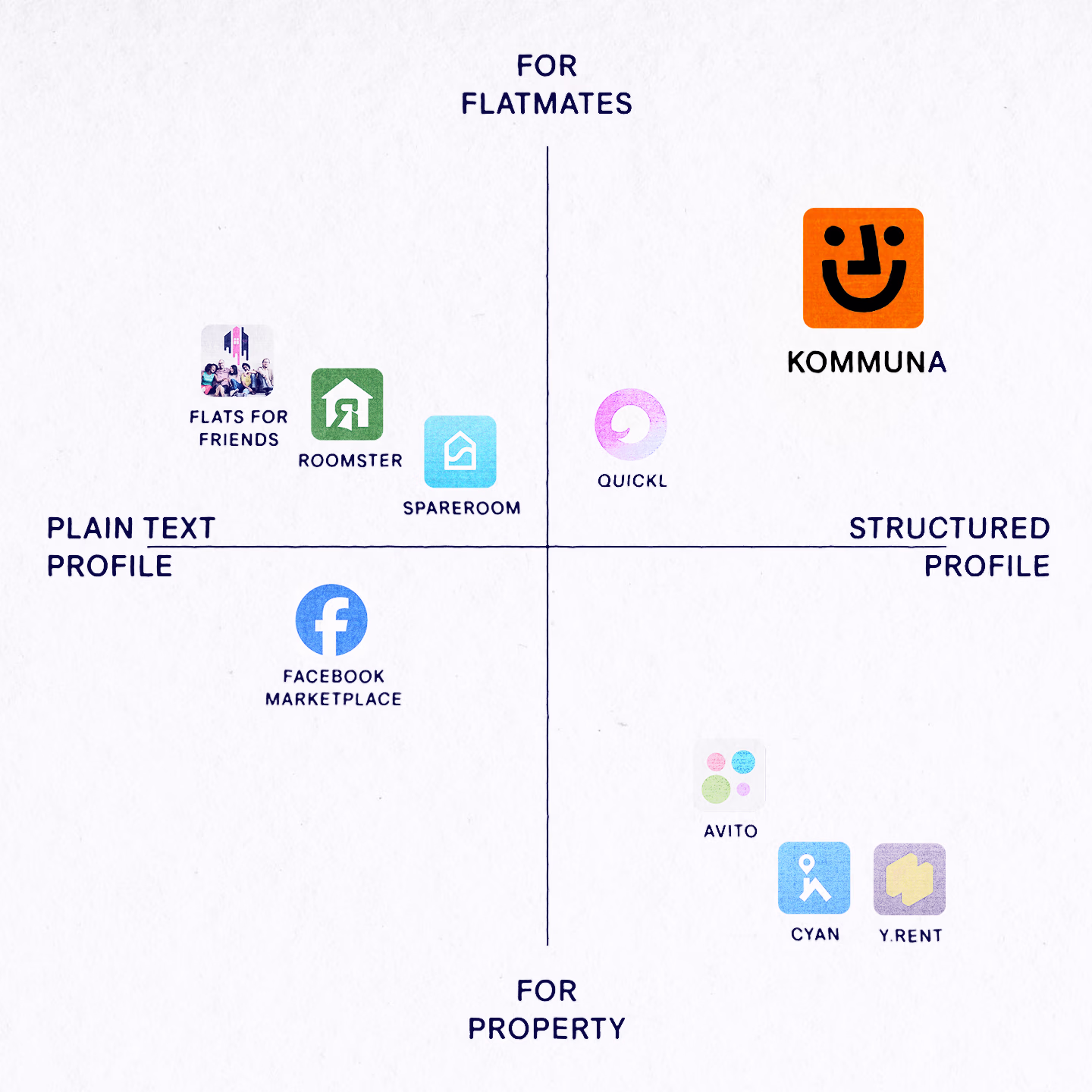
The market for housing search is well-developed, so an unexpected differentiator was crucial. And our focus on people helped stand out among the competitors (Avito, Cian, Yandex, etc.) who prioritised properties.
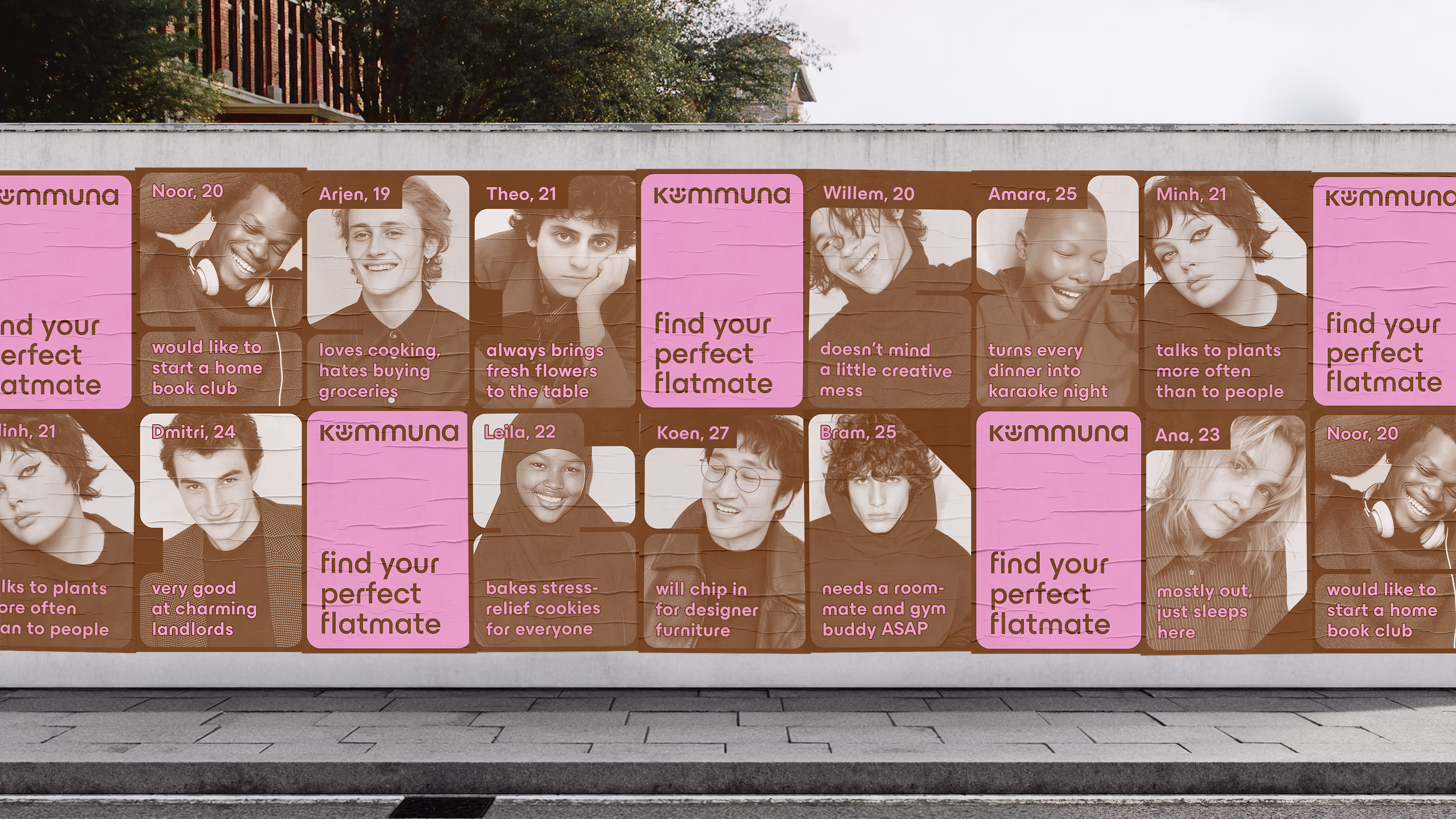
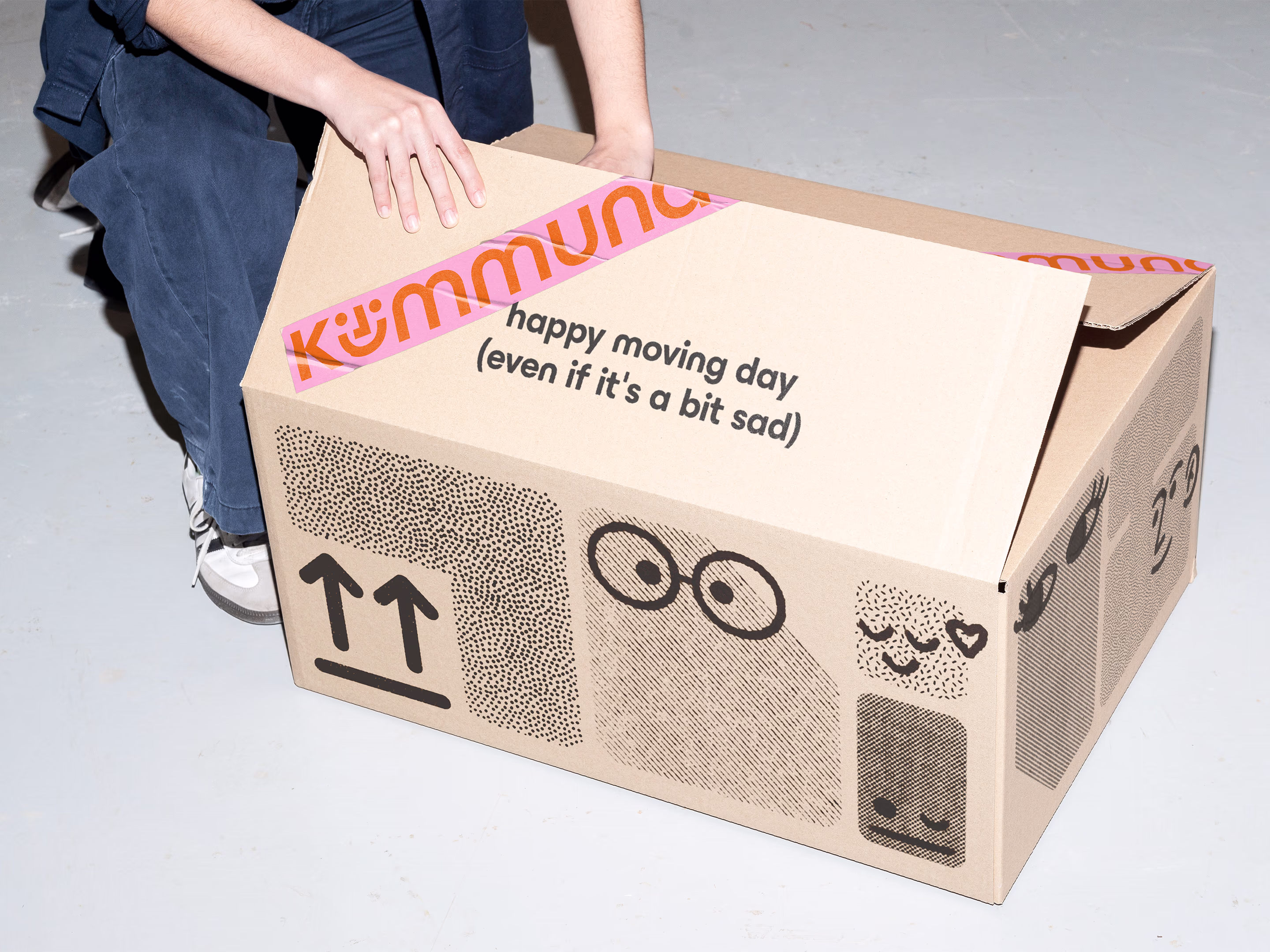
We started with branding. The co-living lifestyle we sell is visualised with a metaphor: a floor plan where rooms fit like puzzle pieces and come alive with unique personalities.
This conveys the idea of sharing space in a way that lets everyone be themselves and makes life more pleasant, simple, and interesting.
So, instead of looking like another cold listings board, Kommuna’s visual language emphasized connection and warmth.

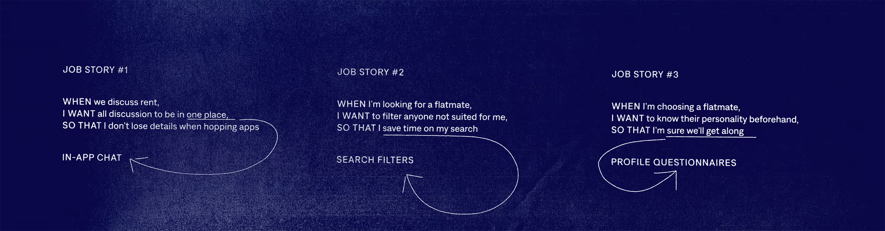
After branding was done, we moved to userflows and wireframes. They were based on Job stories we got from user insights:
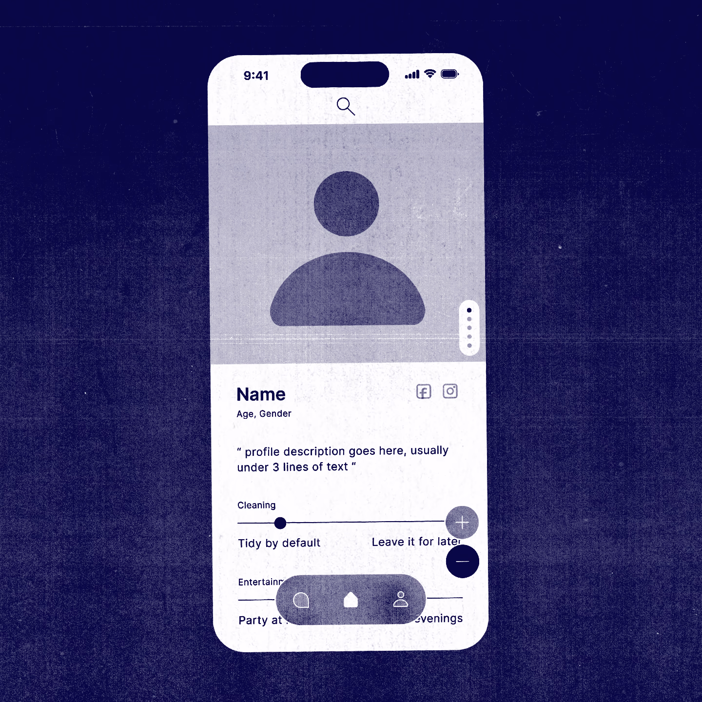
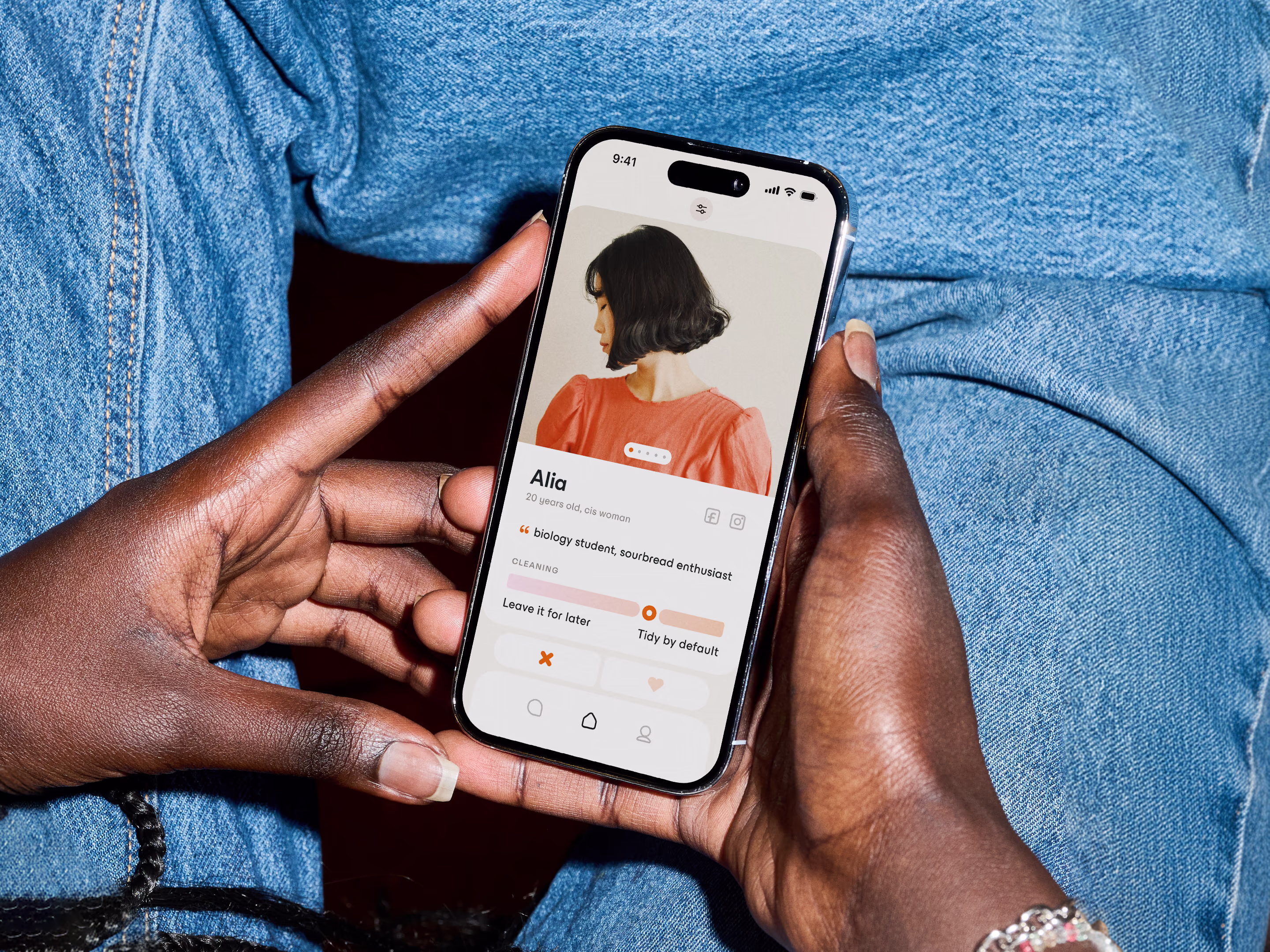
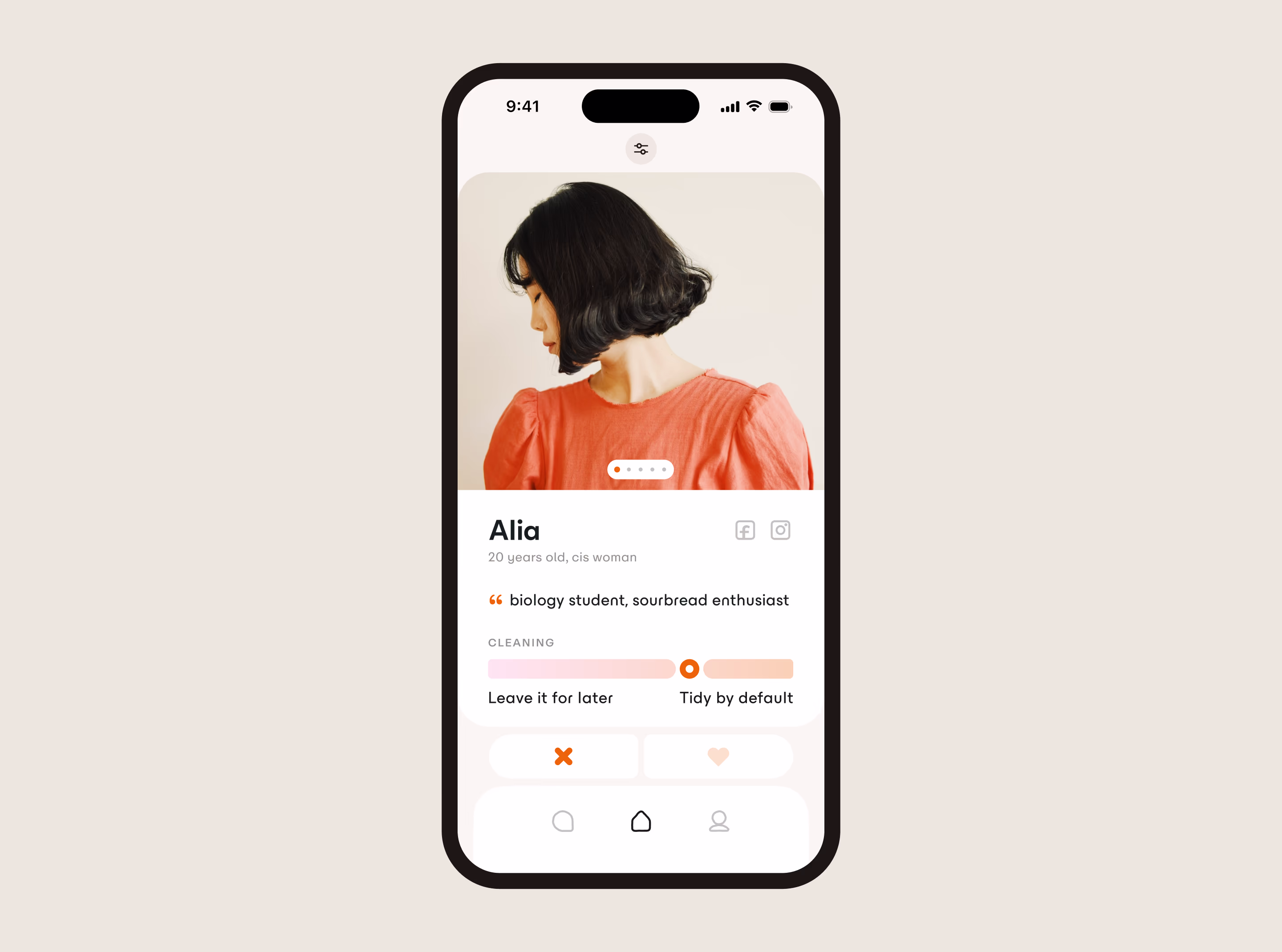
describes a person's lifestyle habits, daily rhythms, and interests. Their apartment can be attached to profile if they look for someone to fill a spare room.
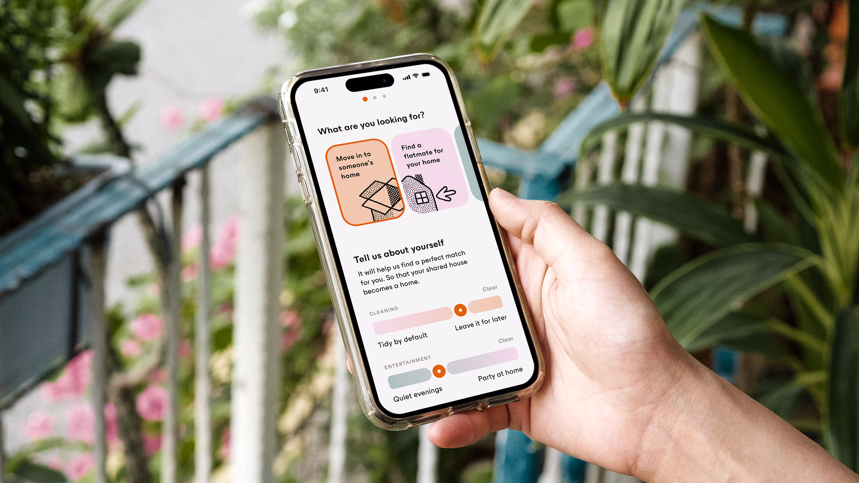
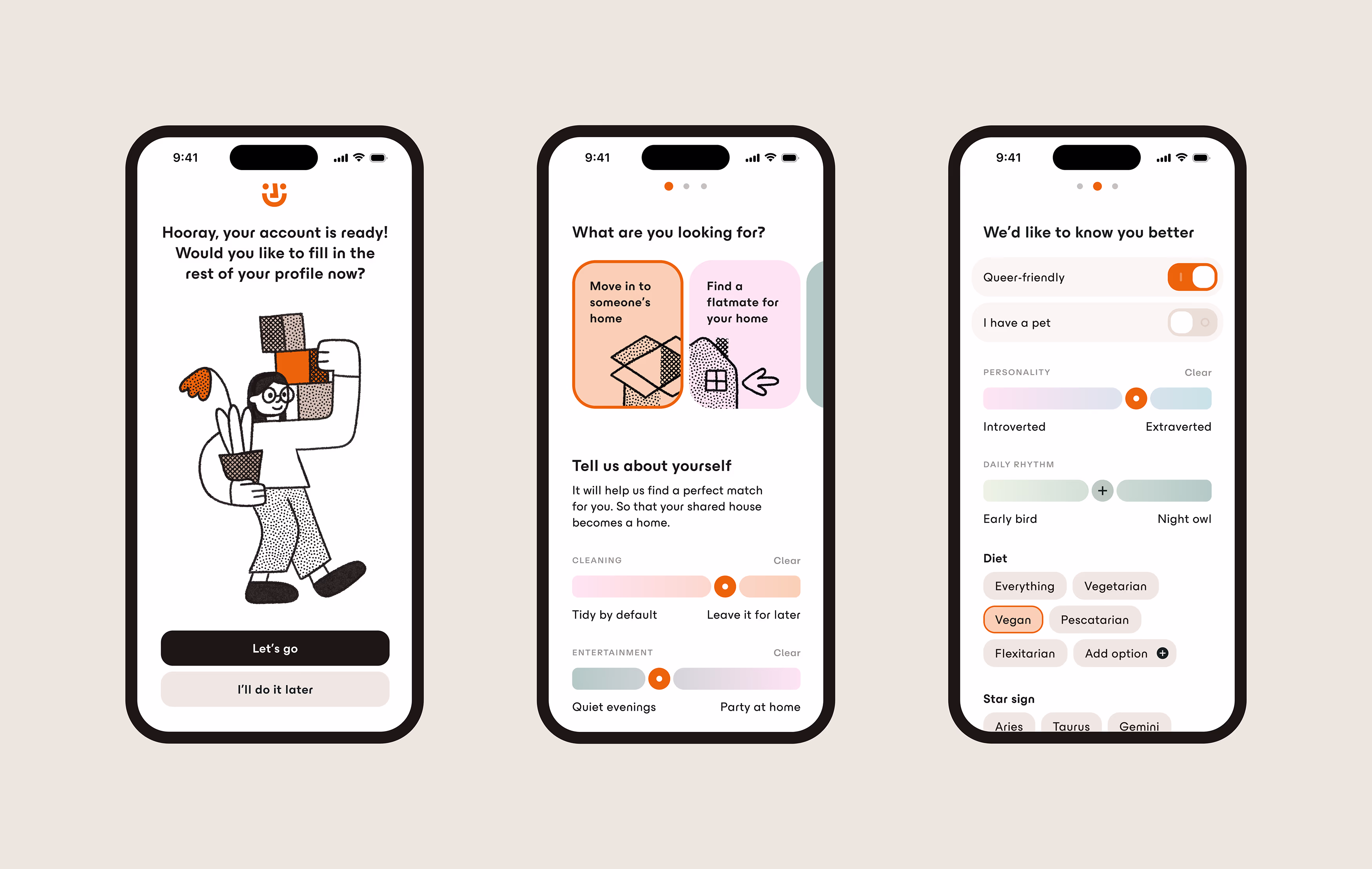
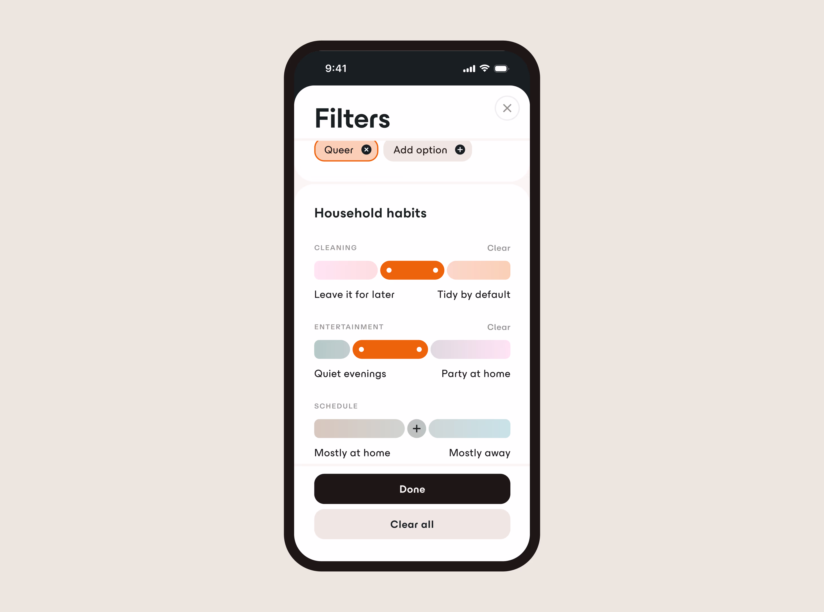
help sort out profiles based on interest — fill someone's spare room, find a flatmate for your apartment, or look for housing together. Personality filters help ensure a good match.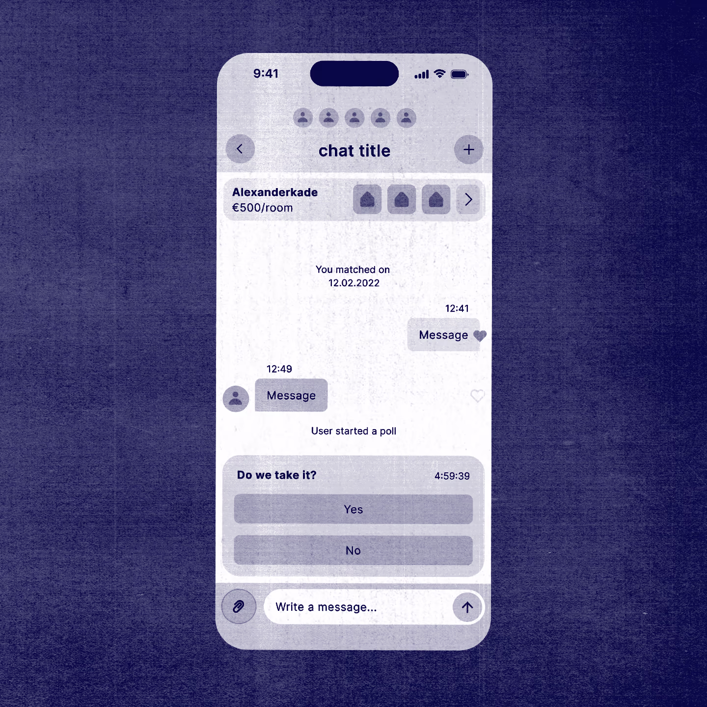
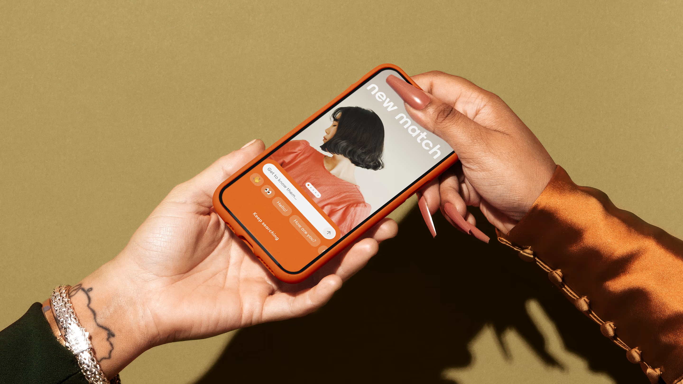
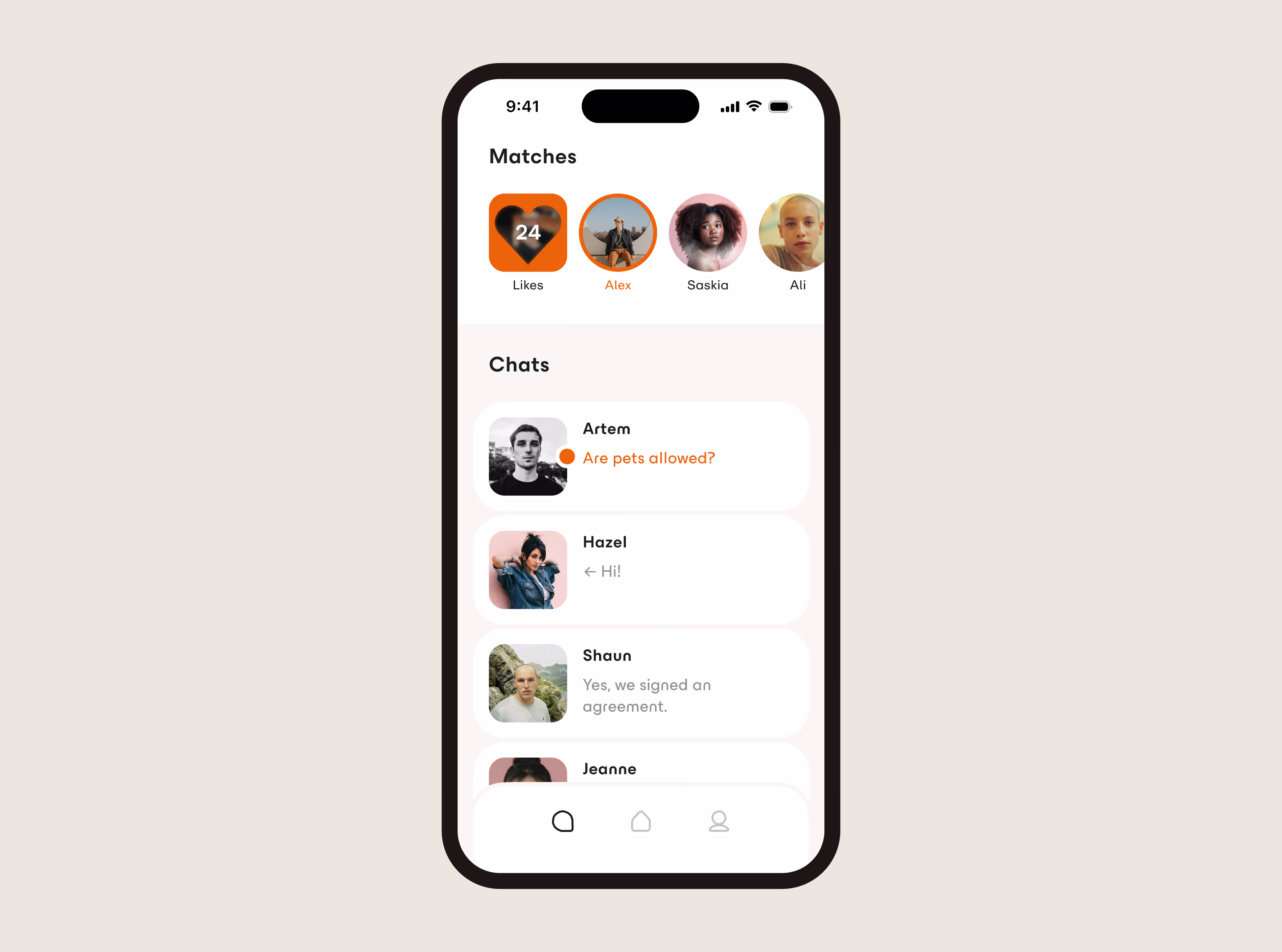
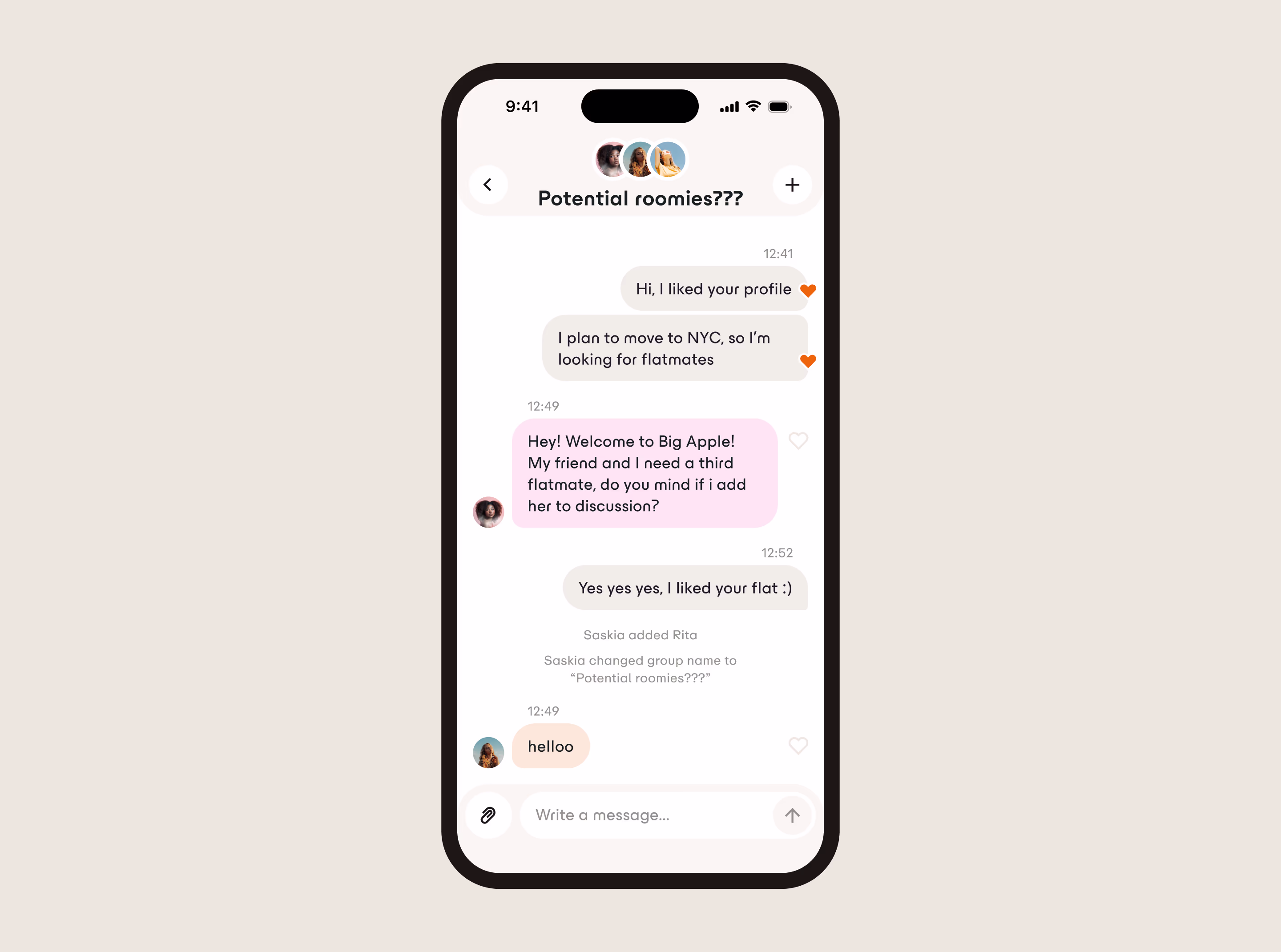
opens up when a match happens to discuss all matters. People can add other matches to this chat if looking for more flatmates.
When wireframes were tested with audience representatives and the userflow proven effective, we got to the interface stage.
A key element in the app experience and look is the Spectre component.
We wanted people to describe themselves in a flexible way that doesn't erase nuances of their personality.
But if we chose the most flexible way — a text field — it would be too time-consuming to write and read all the fields. So we came up with a Spectre.
It is a range between two opposite ideas, in which a user places themselves closer to one end or another. So that people can have clearer representation, and their matches have clearer expectation.
It was important to make sure Kommuna's interface was not only usability-optimised, but also on-brand — because as we researched earlier, positioning and audience comms were crucial for this well-developed market.
We distilled the branding strategy and visual identity to UX/UI principles:
- Emphasis on people and their personalities.
Big avatars to foster empathy, bright profile descriptions. - Softness and warmth.
Achieved with palette and big rounded shapes — like pillows. - Spaciousness.
Controls are ergonomic and chunky, and they are surrounded by empty space to reduce cognitive load.
The UI designing was organised using the Atomic Design System approach — from Quarks to Superorganisms. Later we used the same system for development
Development: I created a database on Ruby on Rails and connected it to the front-end I developed on React.