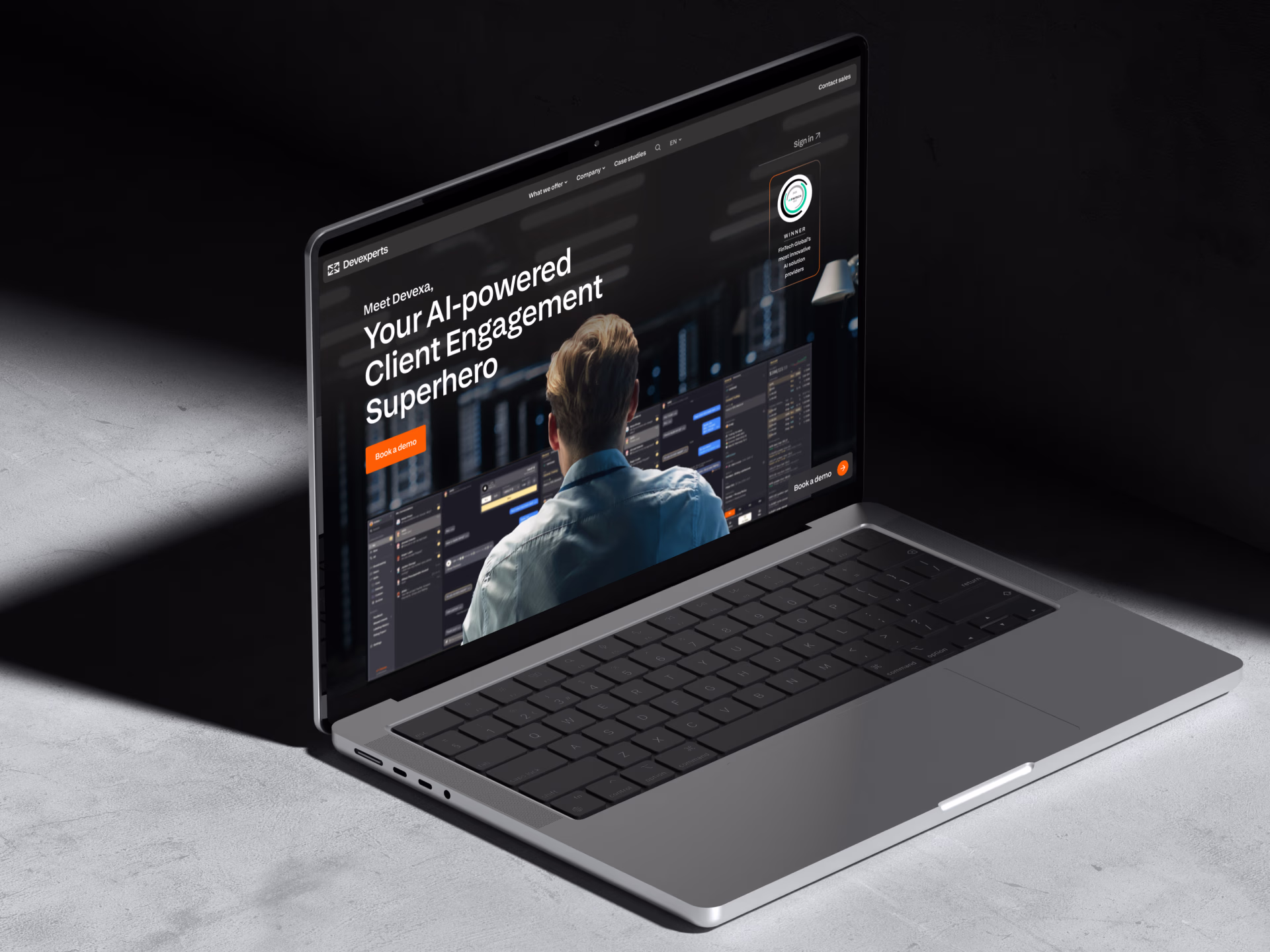
Devexperts.
Digital transformation for a B2B2C fintech giant
Summary:
The strategic redesign I led helped turn the ineffective website into a sales-ready platform.
- Demo request page conversion rate
- 12% → 26%
- 12% → 26%
Problem: After a period of stagnation, it became clear the website no longer reflected the company’s strategy. Unoptimized, it failed to convert on its own, becoming just an additional material during sales calls.
Following the rebranding made by Verve, it was the website's turn to be updated. Not only should the visuals have been redone, but the whole user flow: the website failed to achieve the main business goal — shifting from relationship-based sales to more scalable acquisition. Here are the key factors that contributed to the problem:
- Outdated design
did not reflect the positioning. - Poor UX
and unclear userflows led to low conversion rates. - Missing design system
caused a lack of consistency and an unoptimized workflow.
Research: How can we create a web experience that increases trust, communicates quality, and supports conversion — without overwhelming users?
Through discussions with stakeholders across the company, I mapped out the current pain points and expectations from different sides — marketing needed clear conversion funnels, sales wanted trust-building signals, and designers wanted a scalable design foundation.
Then, I conducted a competitive analysis to understand how similar fintech companies communicated product complexity and credibility, and what solutions work.
- Product differentiation problem.
It was hard for users to choose between similar products based on unclear brand names rather than proposed value and comparison. - Lack of trust.
Relying on general wording rather than quantified success evidence, the website did not reflect the company's expertise. - Inconsistent experience.
Absence of a design system caused product and marketing teams to treat their pages separately, which made it harder to create a streamlined funnel.
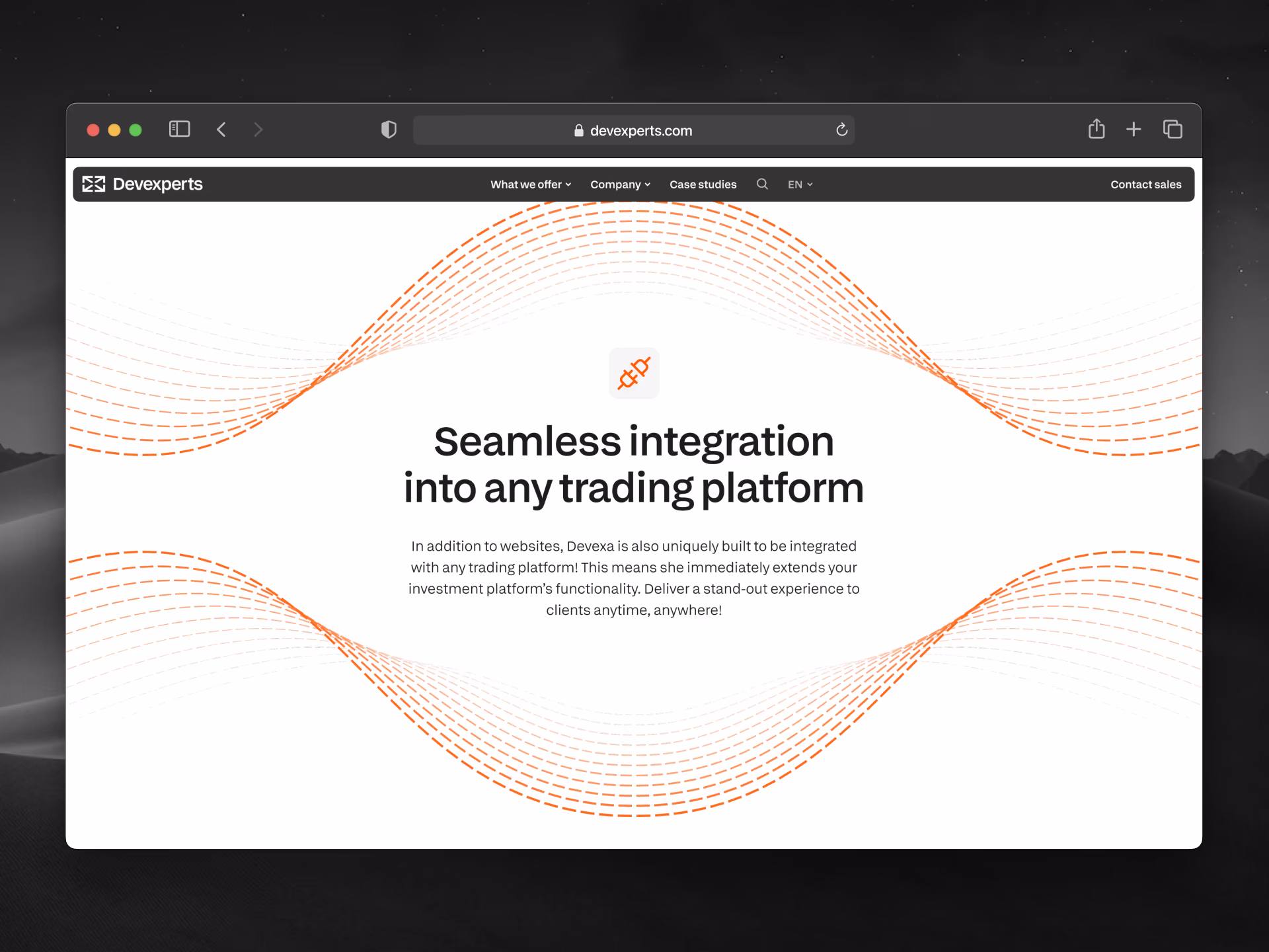
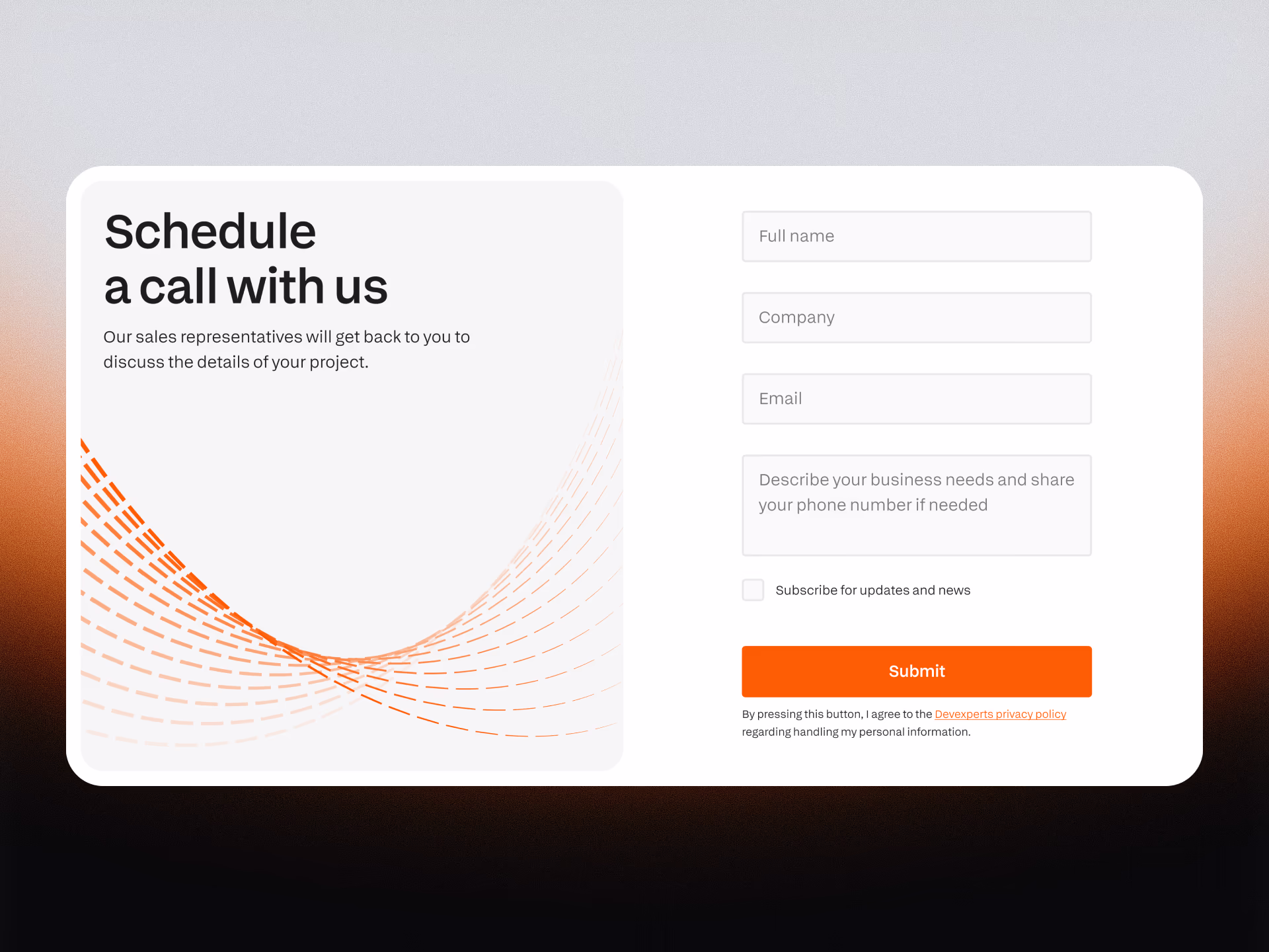
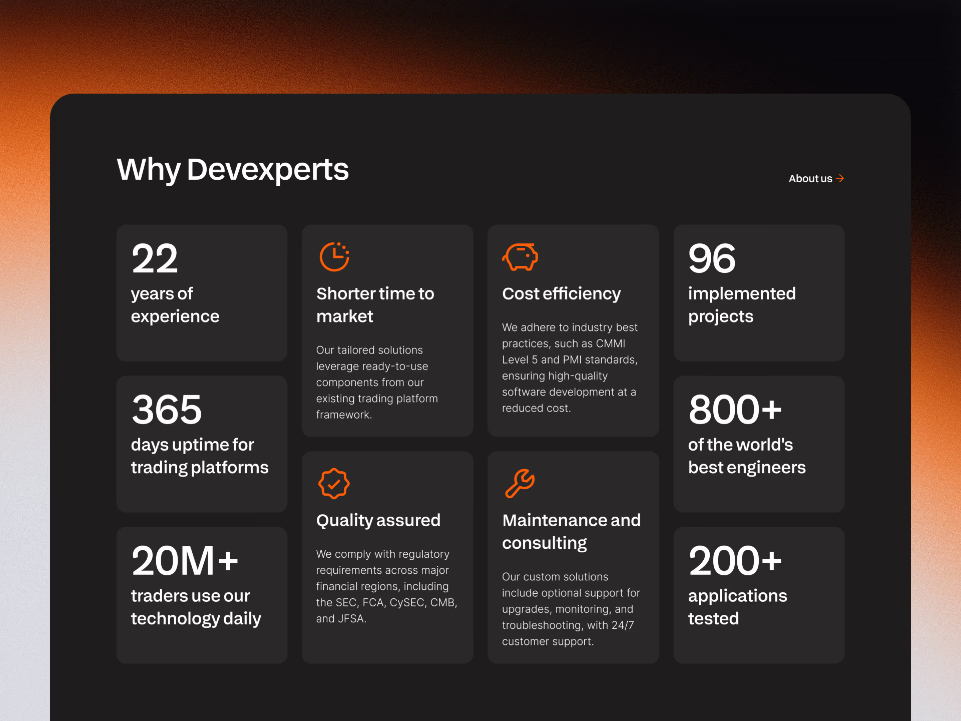
Solution: A scalable design system and a website redesigned around a clarified userflow and the new brand identity.
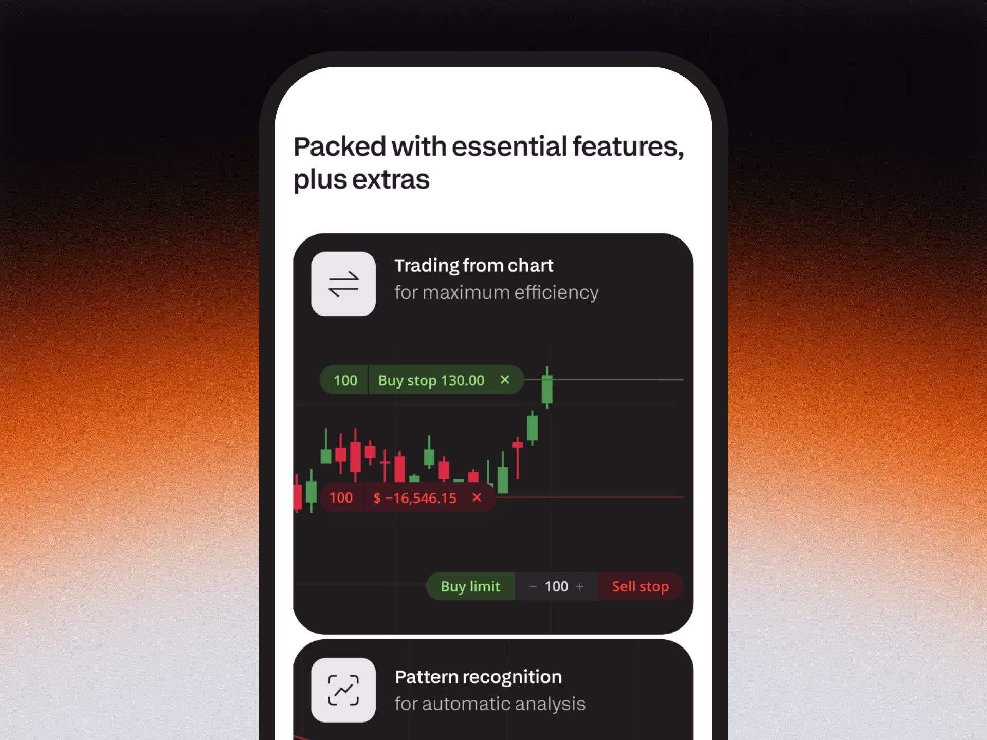
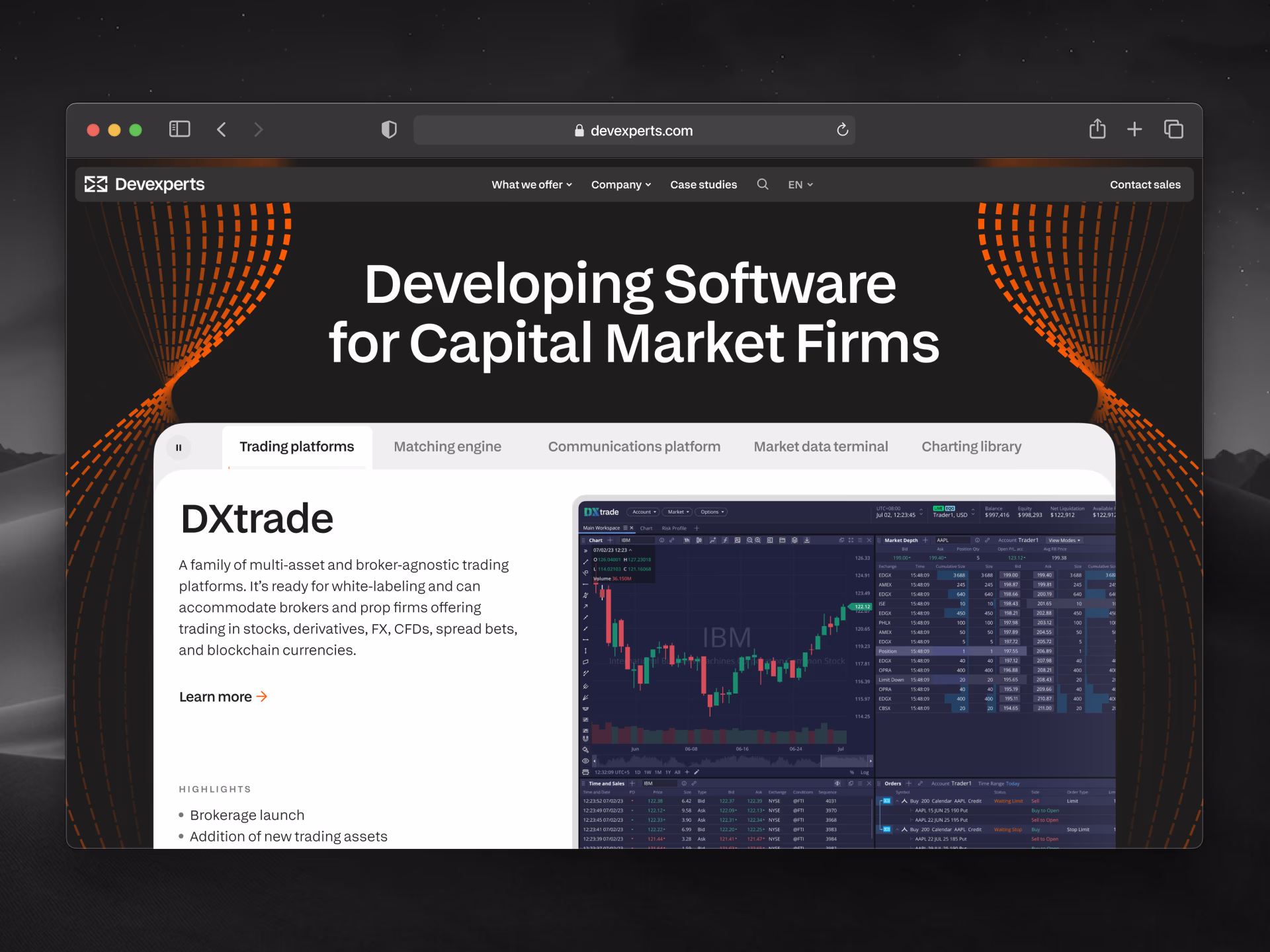
I introduced a modular UI and rewrote product sections to highlight benefits and use cases, not just brand names. The system emphasized consistent layout structure with card-based patterns, and utilized alternating light and dark themes to highlight core messages.
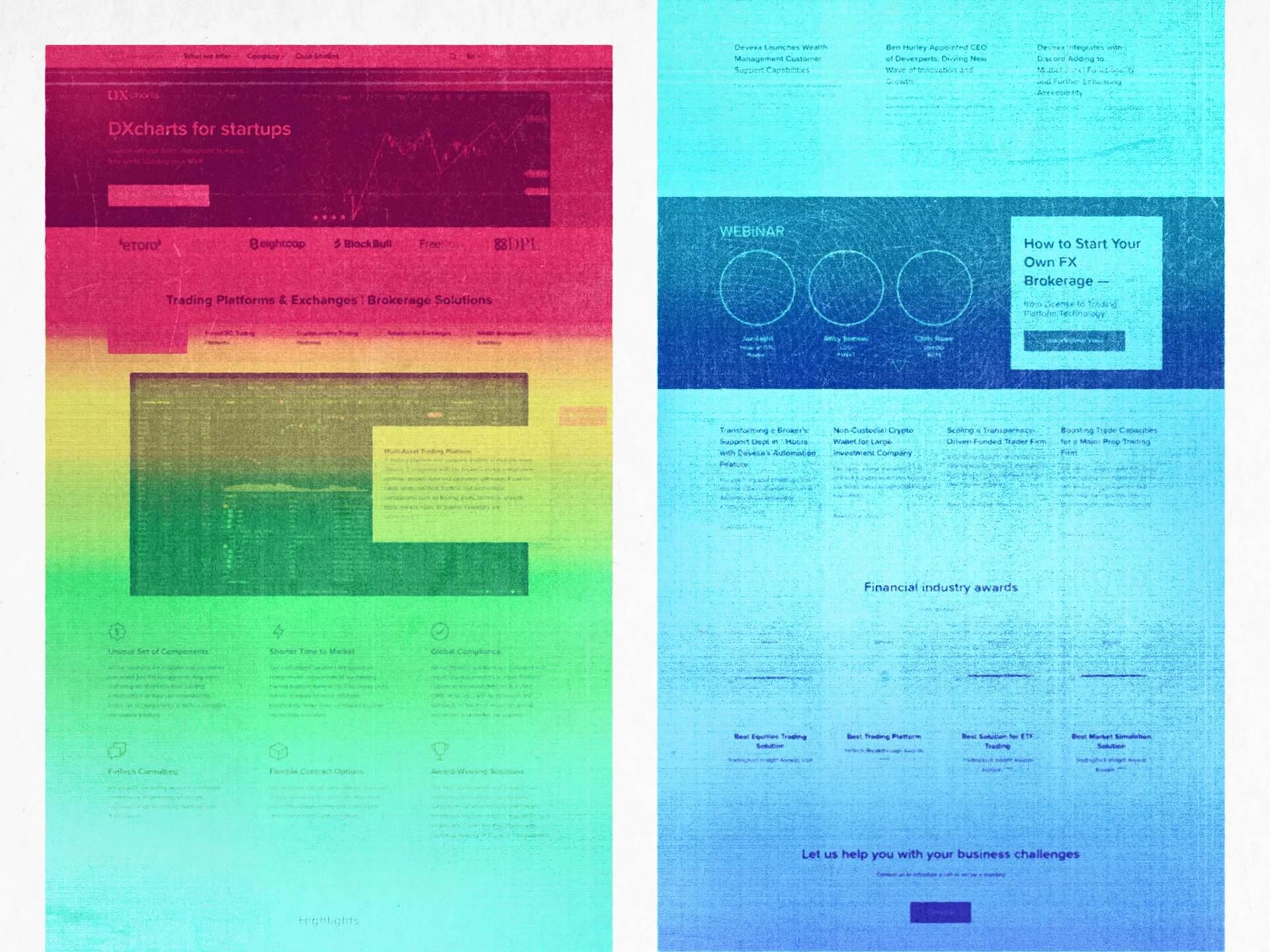
We added interactive product displays, improved case study presentation, and used proof points like product metrics, awards, and partner logos to reinforce trust.
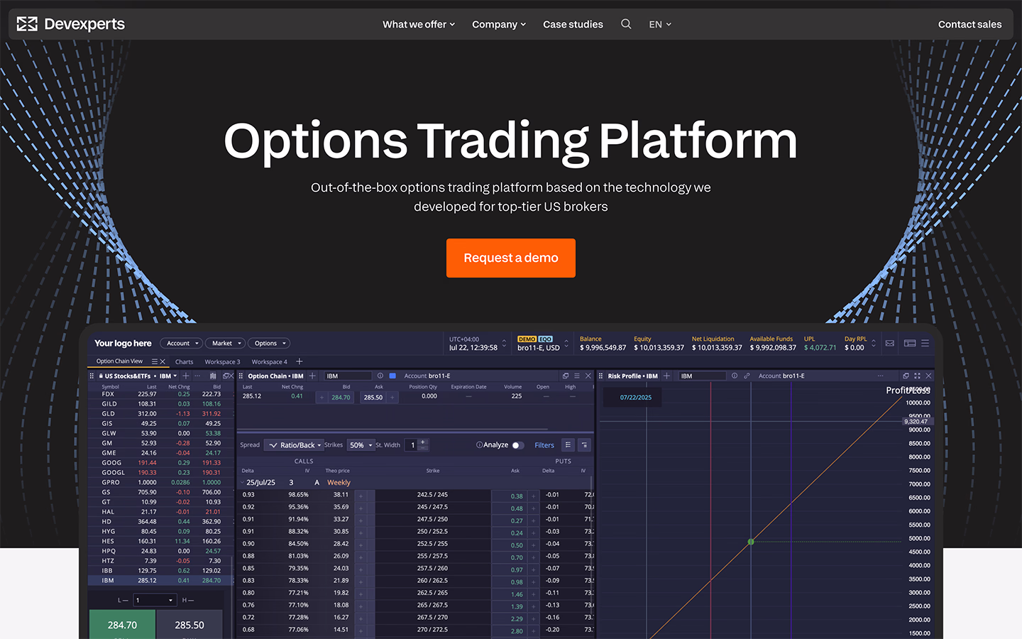
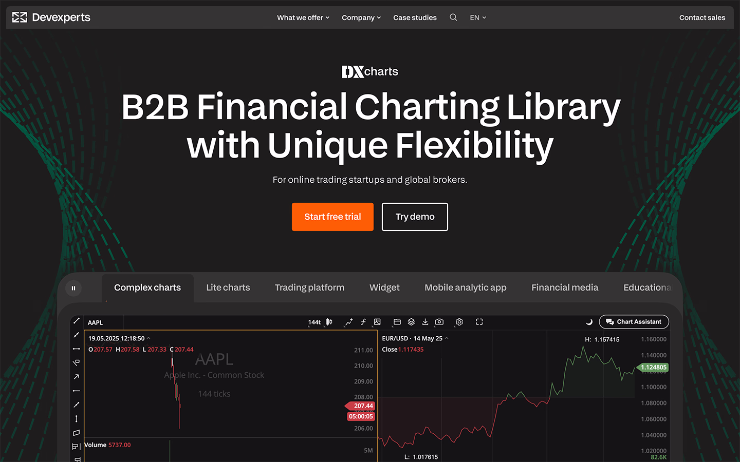
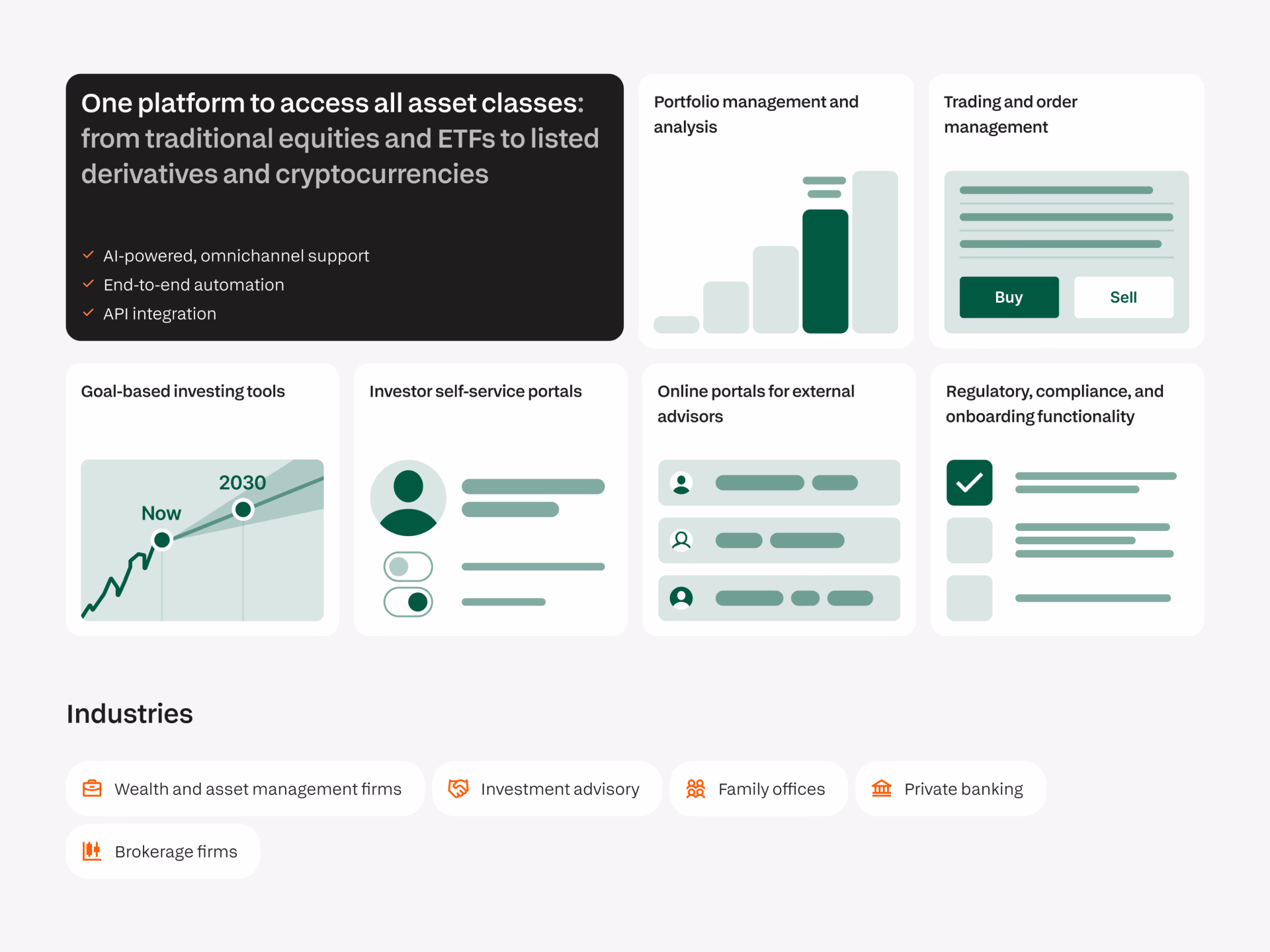
To create clearer product differentiation, all landing pages were unified under similar structure and the same design system foundation — with room for branding and content unique to each product.
I built components using an atomic design approach, from basic elements like buttons and inputs to complex reusable content blocks. The system emphasized modularity, flexibility, and clarity, so that new pages could be created quickly and consistently.
- 183 UI components, automated to switch between 2 themes and 4 resizes
- 266 design tokens
- 30 styles
Impact:
Significantly improved user behavior, clearer messaging, and stronger design culture inside the company.
- Demo request page conversion rate
- 12% → 26%
- Overall bounce rate
- -2.5%
- Overall scroll depth
- +4.9%
- Over 4 months since redesign, the website gave the company
- 106 qualified leads
- Weekly UI kit components usage
- 1.2k inserts
- UI kit components detachment rate
- 2.4%