Flor et Lavr Gallery.
On cultural framing
Branding in the art industry often follows the White Cube aesthetic(1): deceptively neutral and antiseptic. How do you brand a gallery that is the opposite of this?
Flor et Lavr Gallery’s selection combines many opposites: Eastern and Western cultures, various schools, different generations of artists. The common thread is an interest in craftsmanship and the translation of eternal values.
The challenge was to create a visual identity that could hold these contrasts without flattening them — or overshadowing the artworks.
(1) In his essay Inside the White Cube, Brian O’Doherty, argues that the seemingly neutral white-walled gallery is in fact a constructed ideology of modernism and cultural elitism. Its sterile space creates an illusion of objectivity while binding the artist to a privileged viewer and making the gallery environment part of the artwork itself.
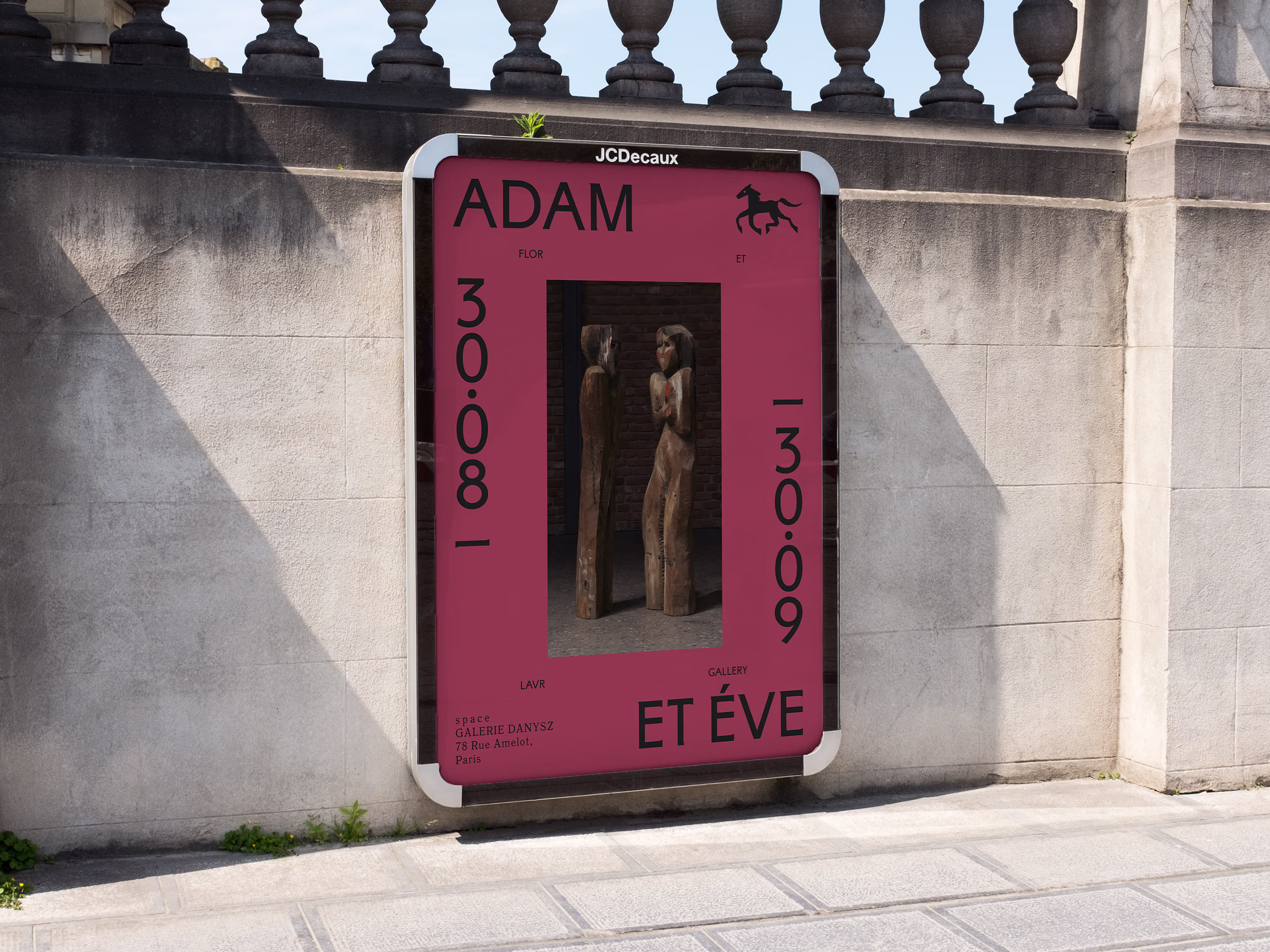
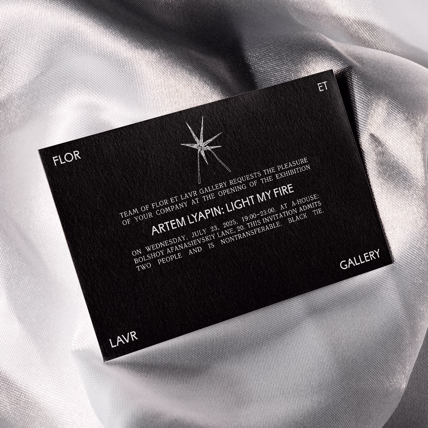
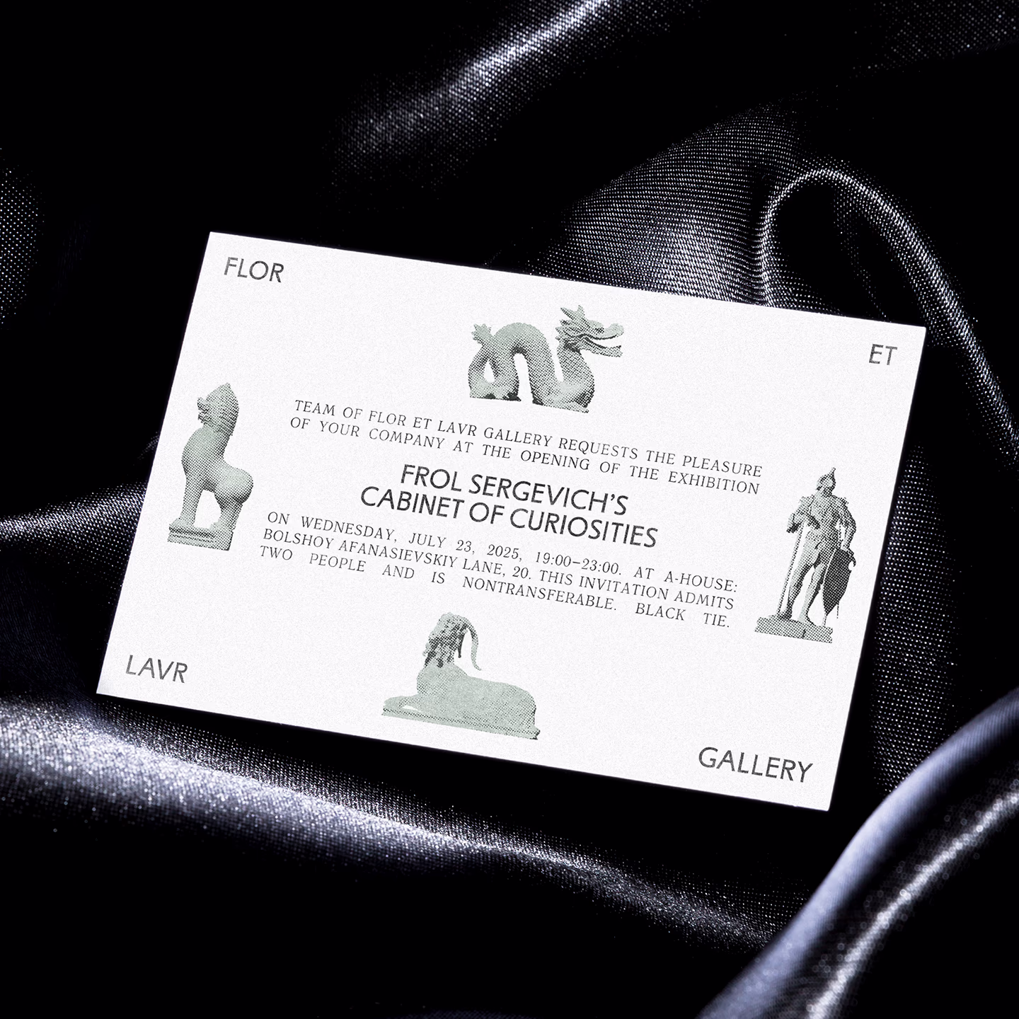
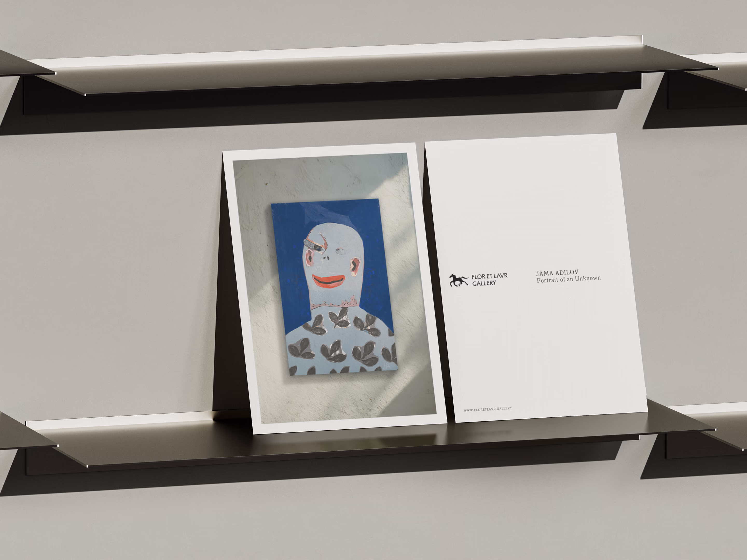
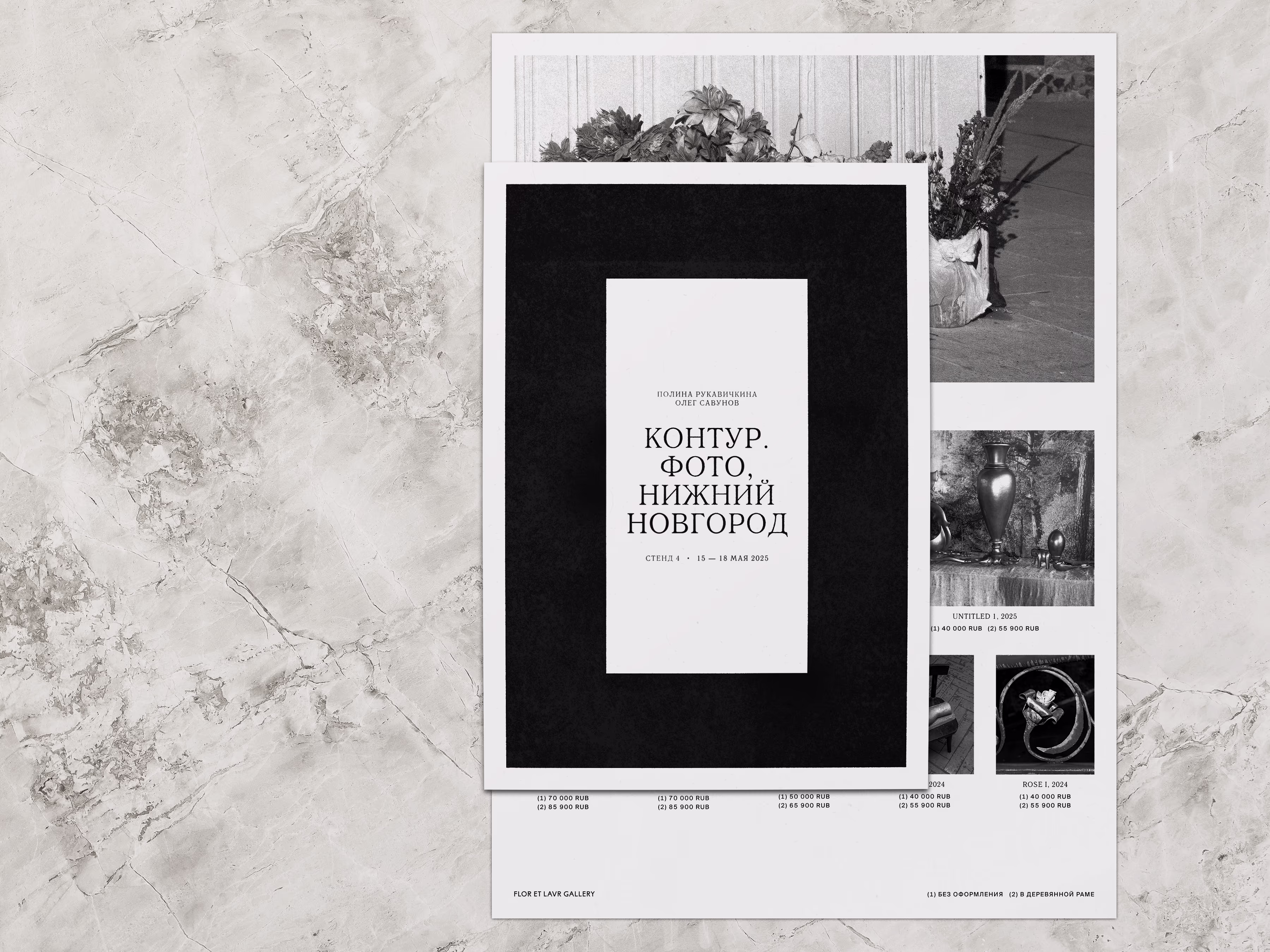
Instead of strict guidelines, we crafted a flexible visual language. From one exhibition to another, it adapts to the character of artists, but has a fixed foundation that ensures recognisability.
Framing, the key principle of this identity, is flexible in styling to accommodate different kinds of works, yet constant in composition to signal the gallery’s presence. This meant creating a system that could adapt from a quiet photo to a busy painting — without losing clarity or tone.
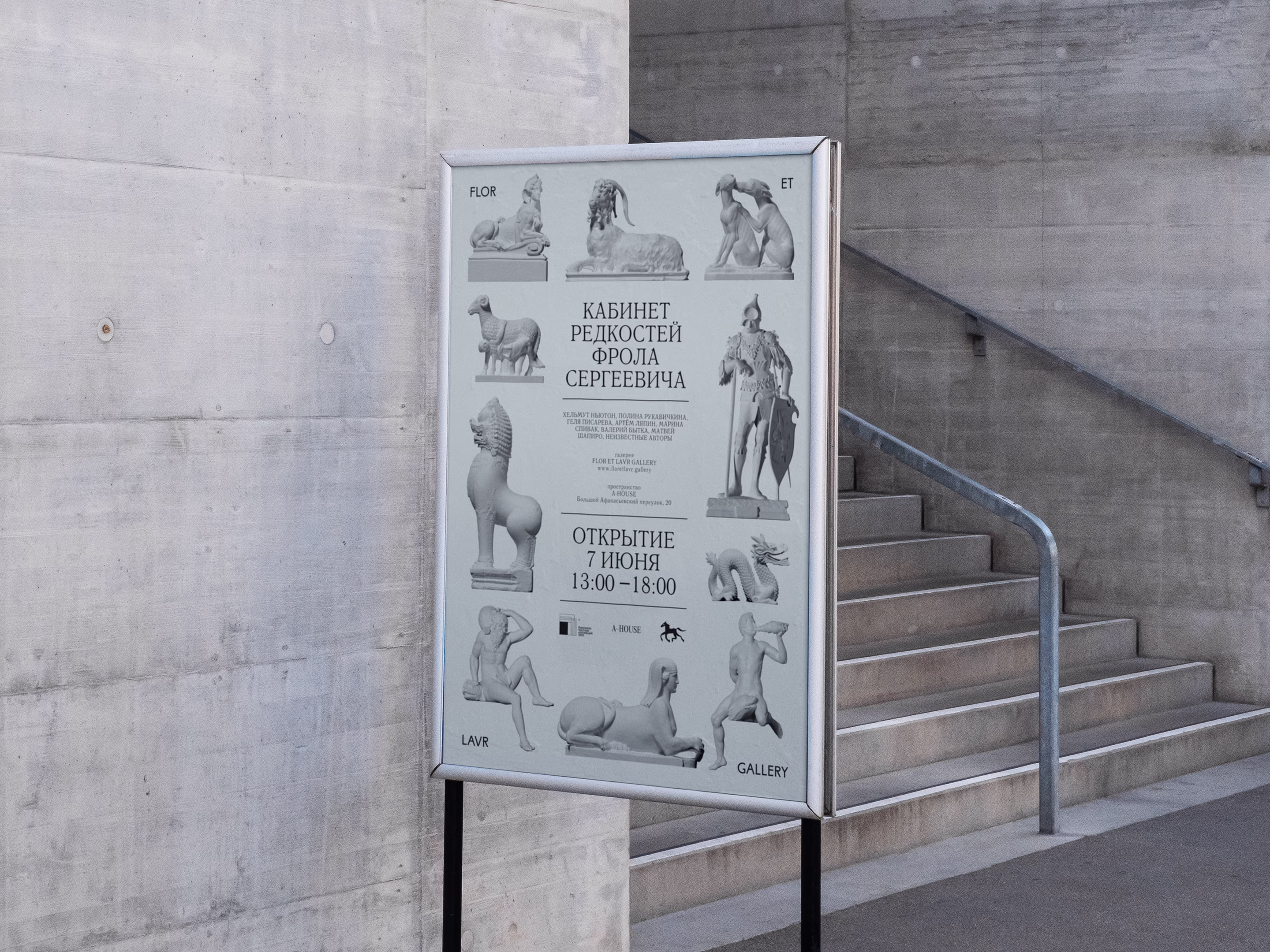

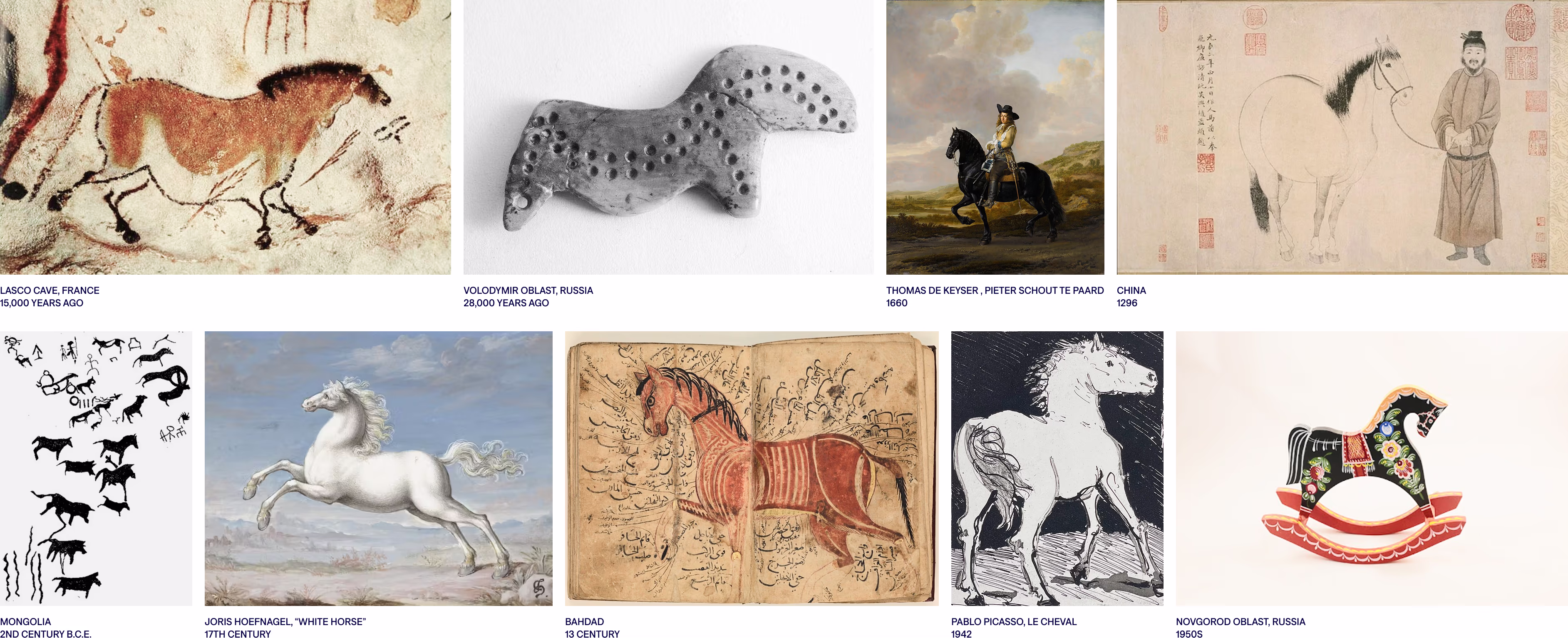
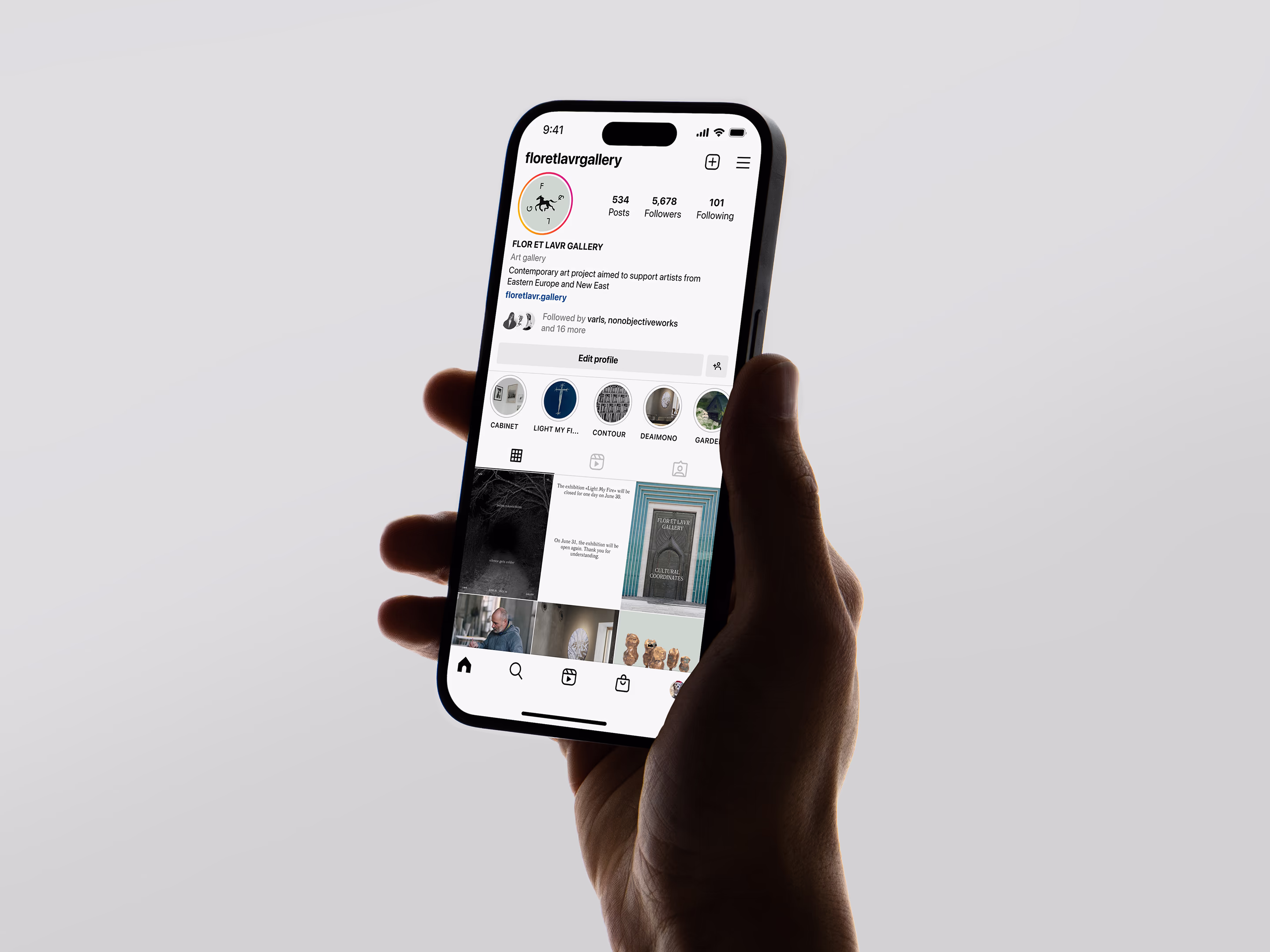
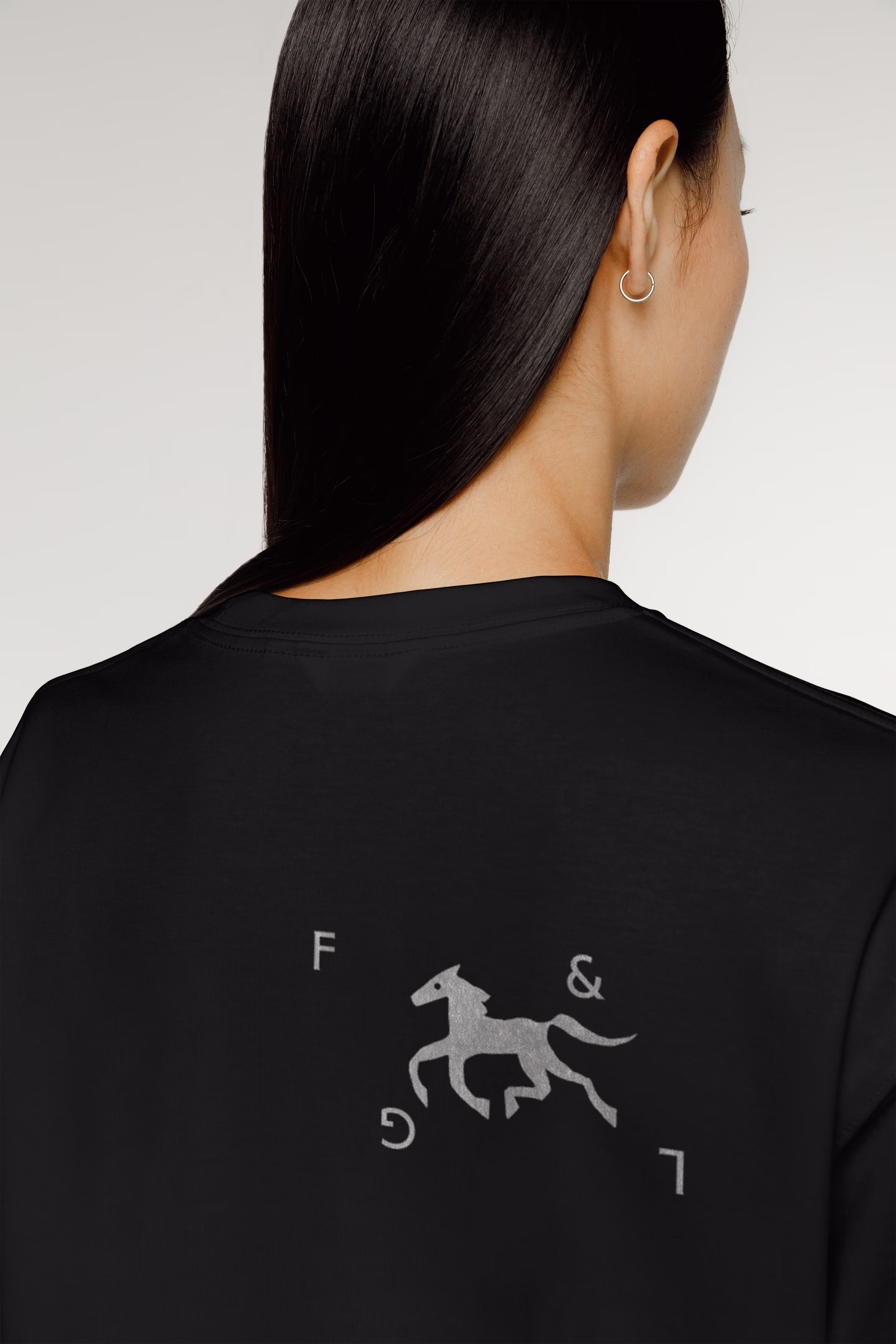
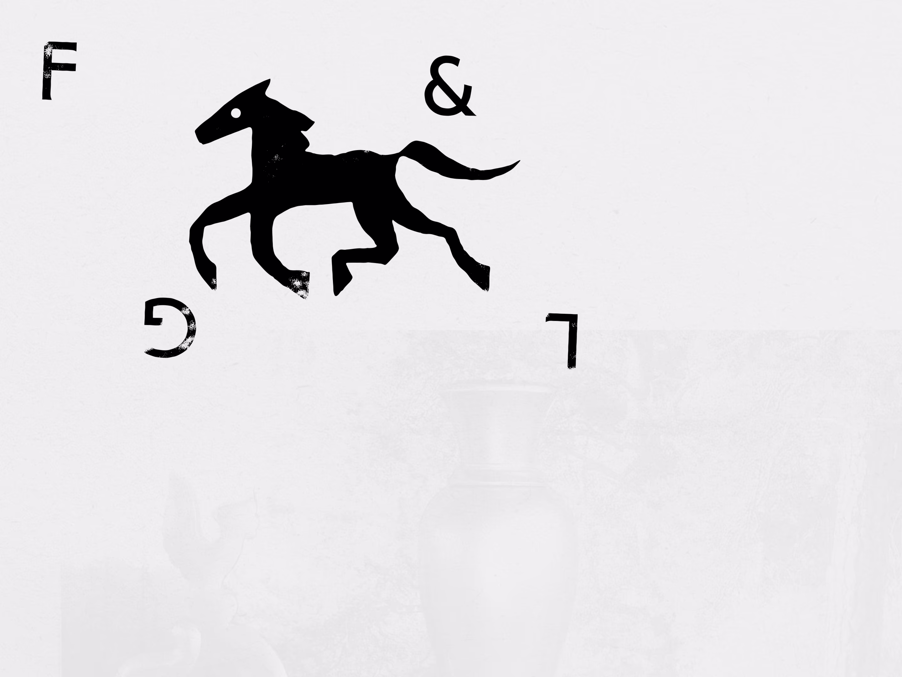
A recurring horse motif runs quietly through the identity, appearing across different materials — a nod to Christian iconography.
In this pictorial tradition, a Saint might be recognised not by their face, but by a recurring attribute: for example, keys for Saint Peter or lion for Saint Mark.
We wanted to find an attribute that could combine all cultures and generations, from the first drawings of cave people to modern art, from Arab horse anatomy to medieval European knight portraits. The horse was exactly that — a universal figure present in the art of every era and geography.
And when we learned that the attribute of Saints Flor and Lavr is also a horse, it felt like a perfect match: a symbol that bridges worlds was already hidden in the name of the gallery.